Client Name:
Eduardo Colin
Company Name:
Colin Construction
Company History:
Colin Construction is a family owned business that has been around for many years. The company was established by our client Eduardo Colin and became a first job for both of his sons, where he taught them both the basics of construction. At Colin Construction, Eduardo manages jobs of all sizes, from re-models to building a house from the ground up.
Designing For Colin Construction
Project Brief:
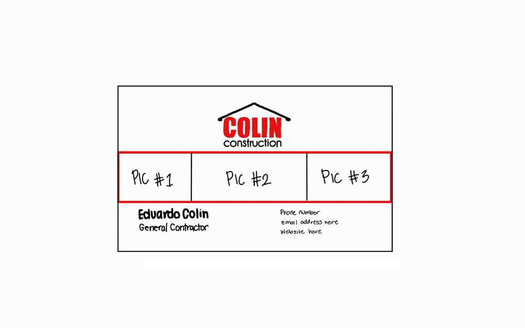
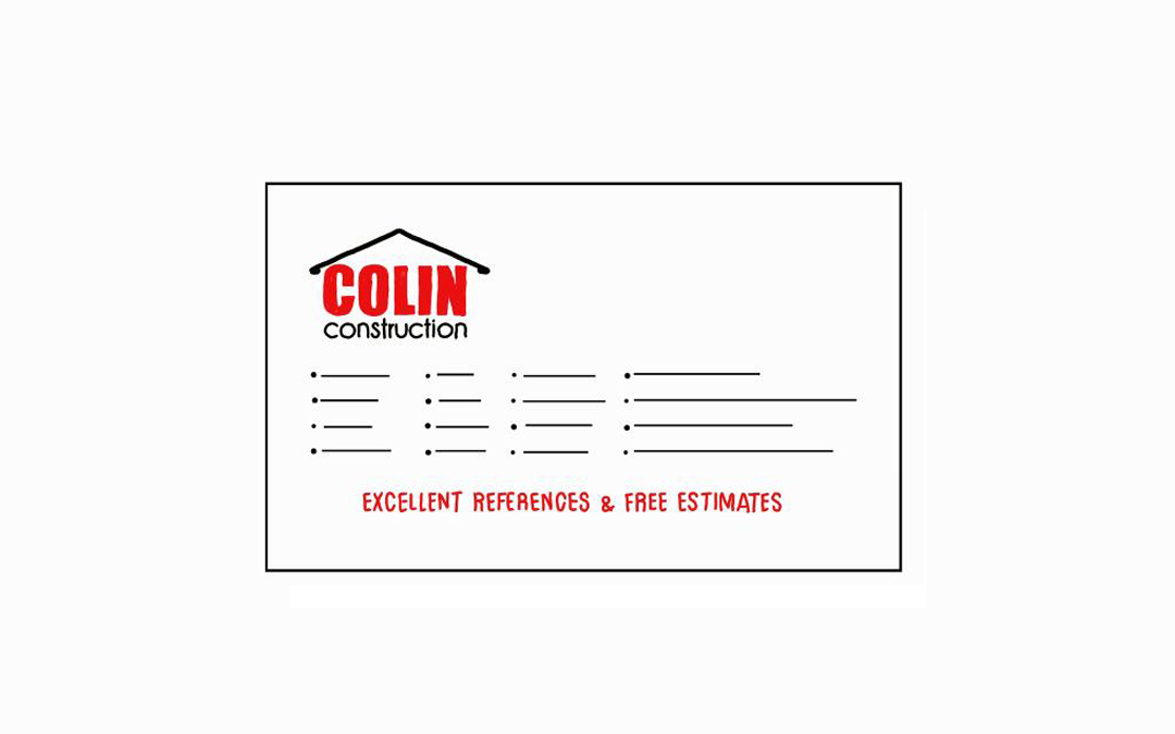
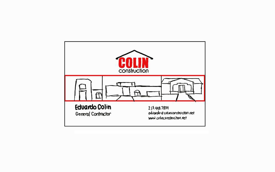
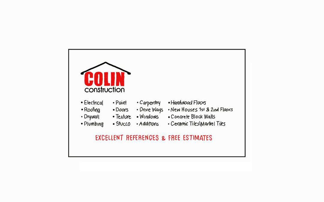
For this project we were asked to design a logo and use the new logo to design double sided business cards.
Project Goals:
The goal was to design a logo for a construction company that was different from all the others we’ve seen. We were asked to create something simple that would look good if it was being printed on a shirt or placed on a website.
Project Challenges:
- Creating a logo that represented our clients construction company that was different from their competitors.
- Keeping it simple.
- Deigning a business card that would look clean even with all the information it needed to have.
The Design Process:
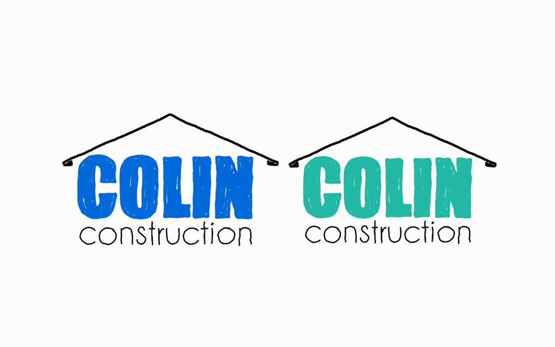
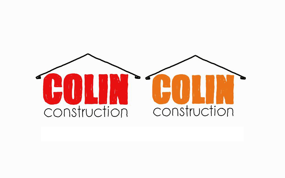
With the help of sketch artist Prince Colin (the client’s son), we were able to create multiple options to show the client. After the client picked a logo design and color we were able to move forward with creating it in Adobe illustrator and designing the cards to fit the style of the logo.
Design Choices Made:
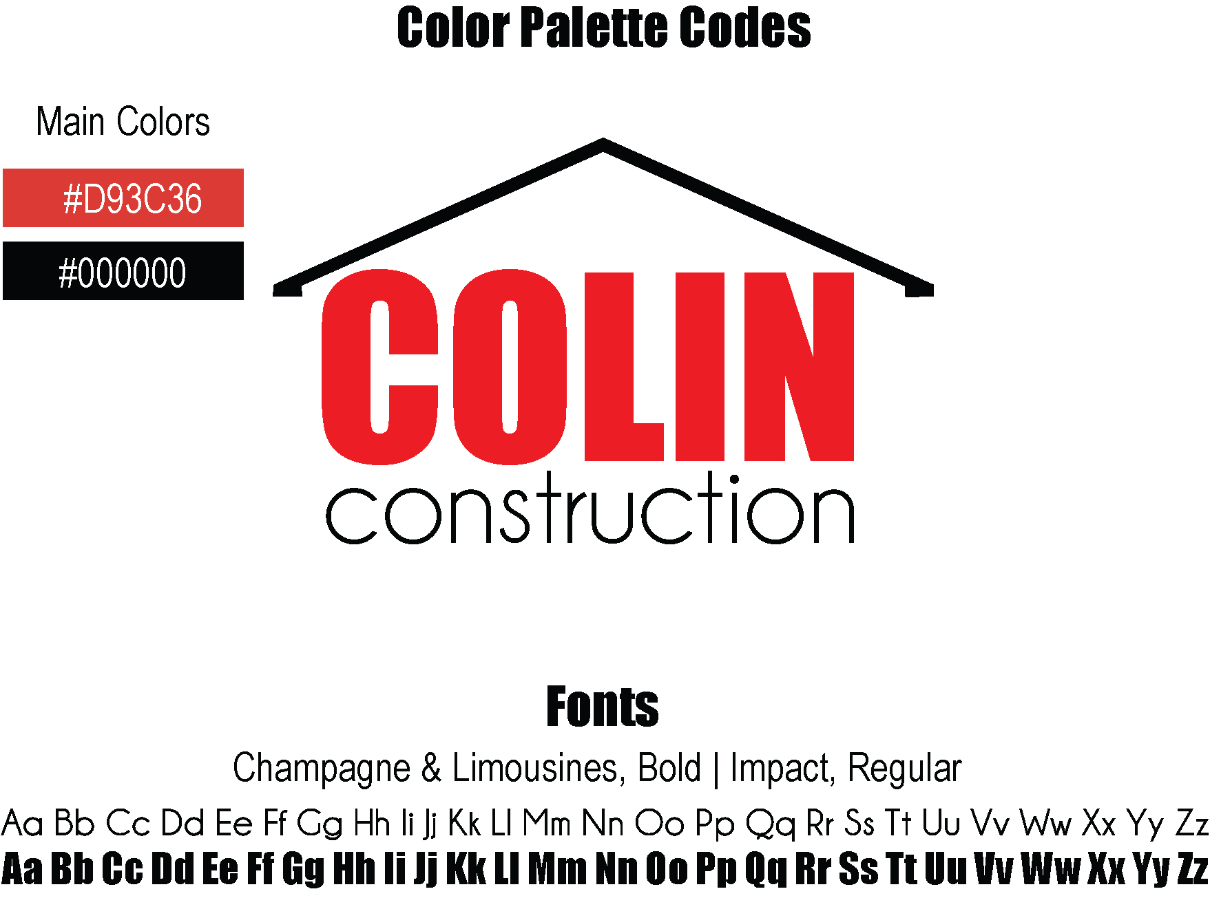
We wanted the colors that we chose for this logo to stand out but to also have positive meaning that would fit the company well.
- Red represents and inspires passion, confidence, strength, energy & love.
- Black symbolizes strength, timelessness, discipline & luxury.
For the fonts we wanted to use a combination of thick and thin letters. Impact (the thick font in red), represents the strength of the company as well as the structures being built by the company. Champagne & Limousine (the thin font in black), would represent the timelessness and luxury of the structures the company builds.
The logo itself is a symbol. The triangle top and the lettering on the bottom were intended to be the shape of a small house. This is the only symbol that is used on the clients business cards.