UNA LA Chapter
“I thank my lucky stars that I happened to meet Jay – she has gone above and beyond for our organization in creating beautiful, thoughtful, detailed flyers. Jay’s professionalism and personable demeanor makes the design process effortless and fun from start to finish in a timely fashion. I needed flyers to promote a new initiative, but Jay took it to the next level in helping to establish a branding aspect to the flyers that tells the story of our organization. It’s so great to work with someone who genuinely cares about the finished product and customer satisfaction. Jay loves what she does and it shows in the superior quality of her work. I can’t recommend her services enough!! Thank you, Jay!!!”
-Jillian Boardman | UNA LA Chapter President
About The Project
The first step to helping our clients includes gathering important information. This information will help shape the rest of the project.
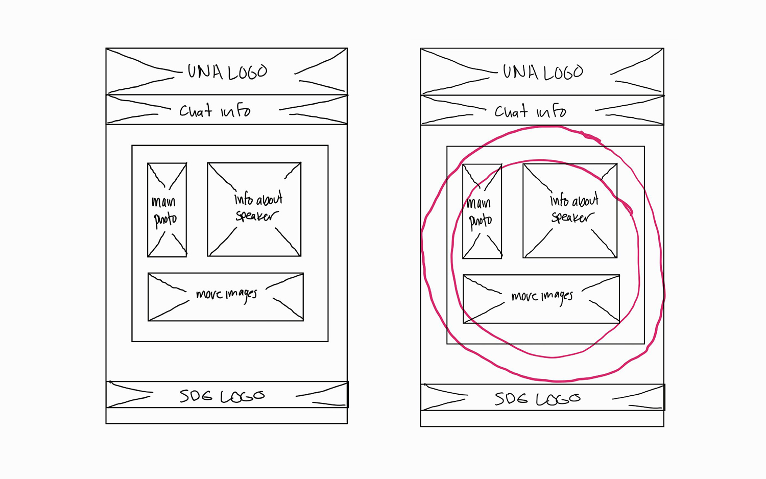
Sketching
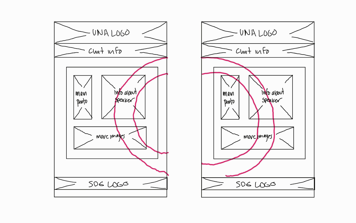
After gathering information and placing the content that was going to remain consistent throughout each flyer we had to find an element to tie them all together.
Project Specification
When building a brand every detail is important to the overall feel of the brand. Choosing the right colors and fonts are just as important as the art work.
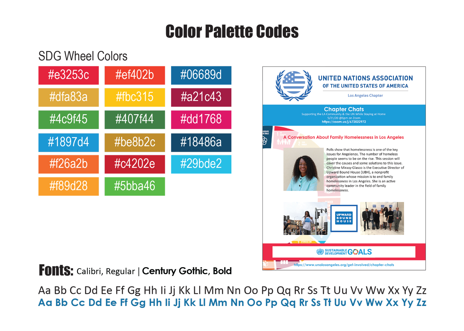
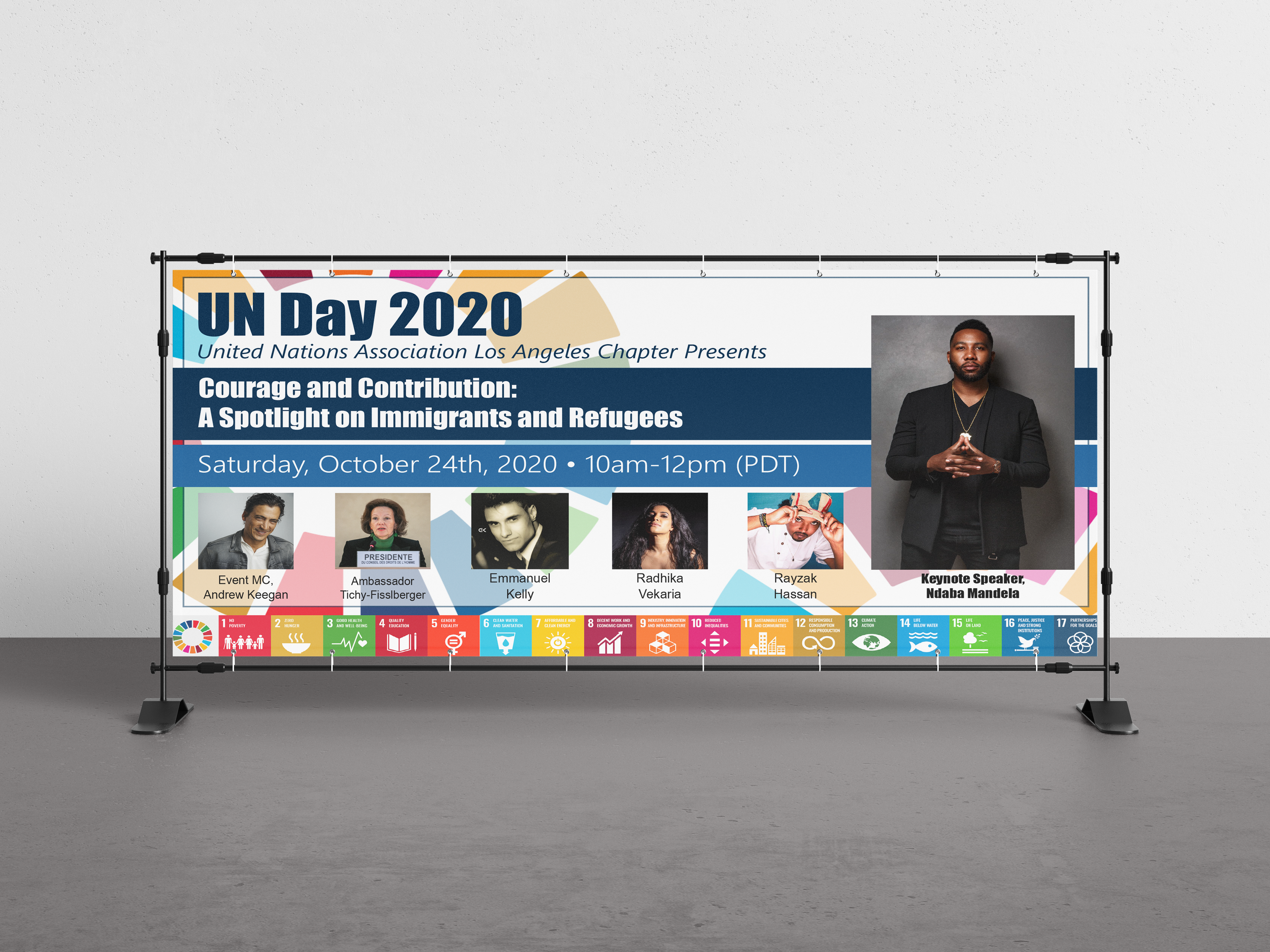
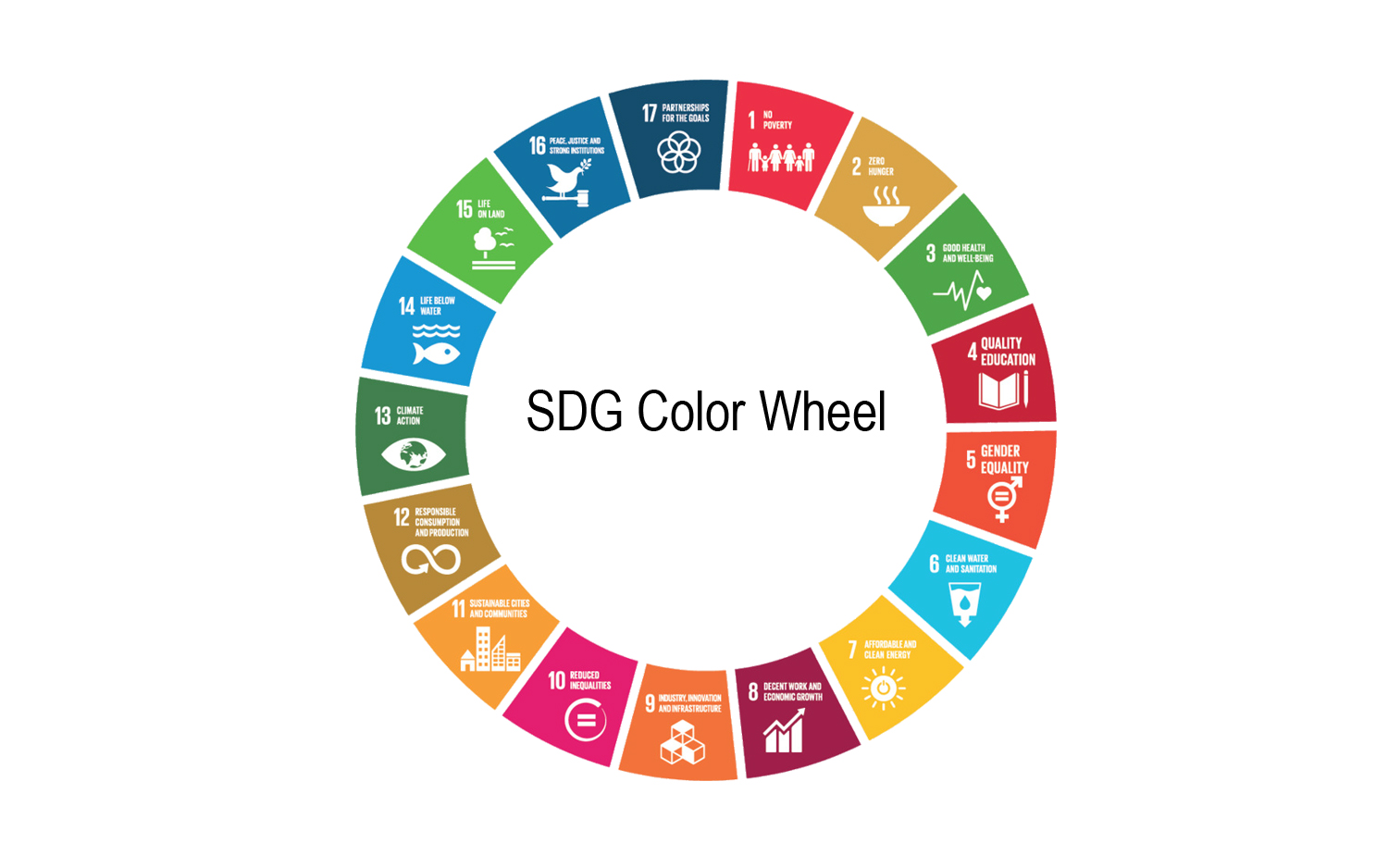
The colors for each flyer match the colors on the SDG wheel. Although some of the colors look the same, all 17 are actually different and represent a different topic/issue being addressed. The main colors of each flyer would also match the SDG wheel topic being addressed in that particular Zoom chat.
The fonts we used remain consistent throughout all of the Chapter Chat Fliers. For the titles and everything that needed to stand out we used Century Gothic, Bold. We decided to go with this font because it’s bold but still legible and has the formal feel. For the main content we used Calibri, Regular. This font is easy to read when providing a large chunk of information and looks good on fliers and brochures.
The symbol that ties all the flyers together is the SDG wheel. I chose the wheel because it's a representation of all the things that the UNA stands for and created a better feel to the background than the squares on the banner would have. Every topic addressed one of the items on the wheel.
Final Product
More Projects ...
Ready To Get Started?
Are you ready to start on your next project? We are ready to help! Click the button below to schedule a consultation call.
