About The Project
The first step to helping our clients includes gathering important information. This information will help shape the rest of the project.
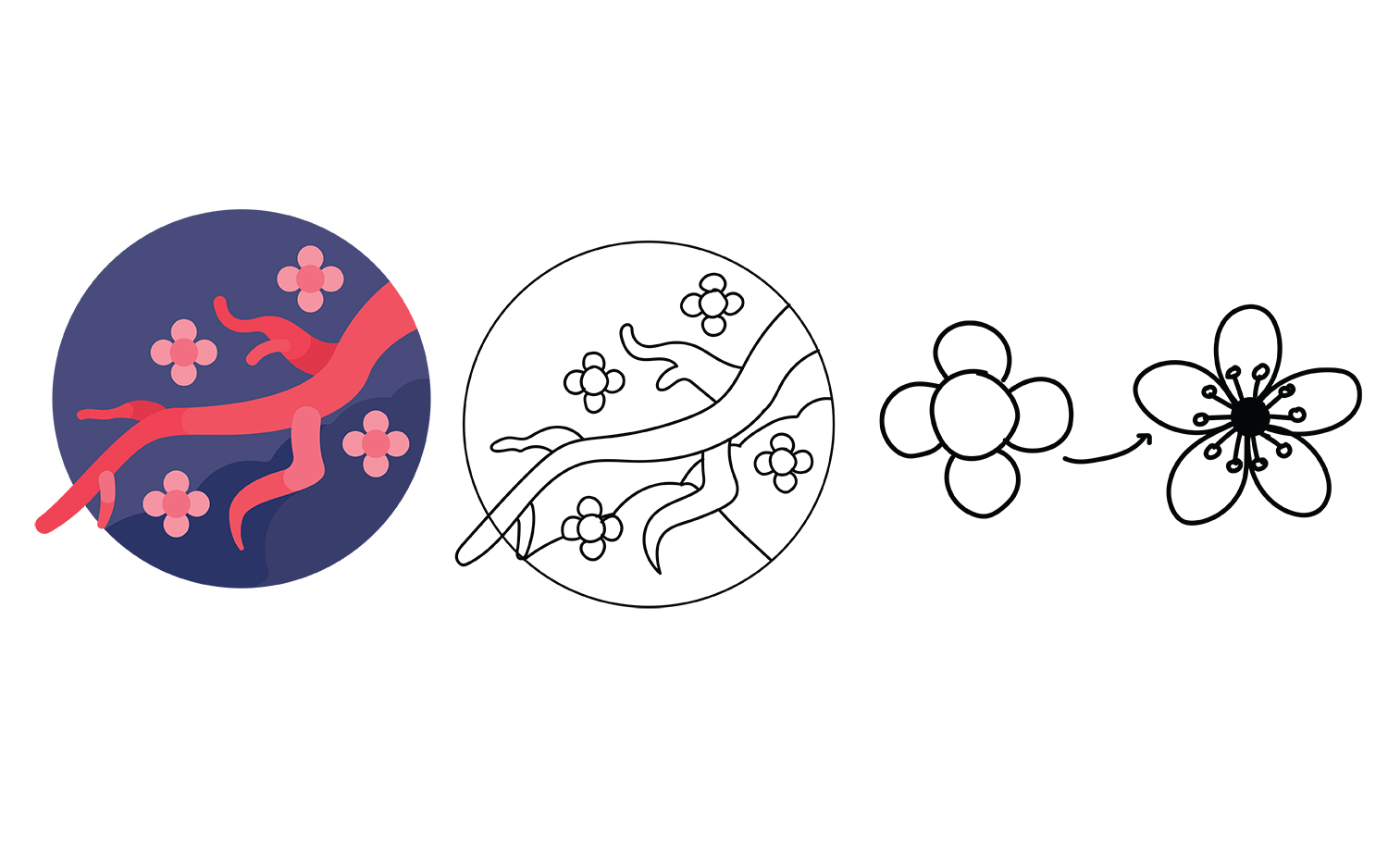
Sketching
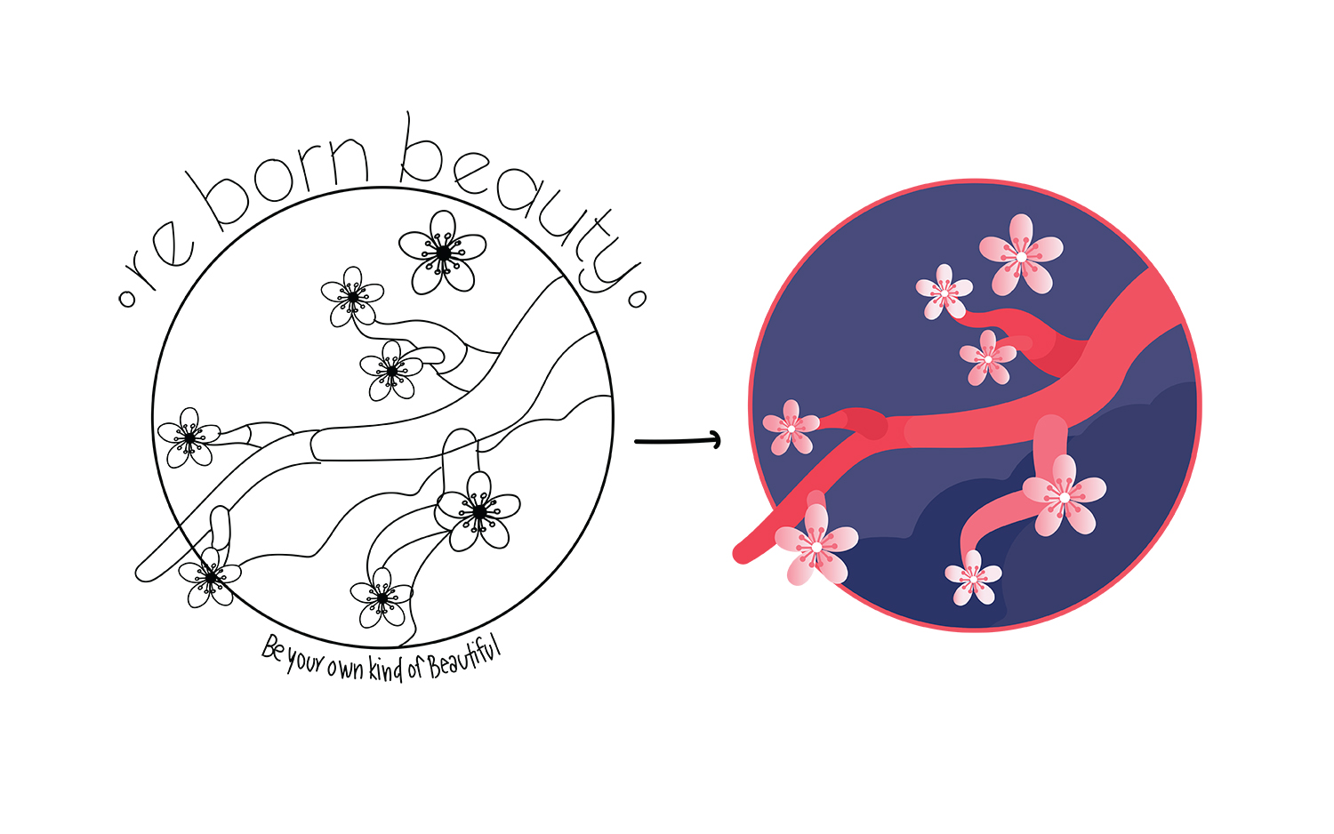
Sketching is a vital step in the process of design. Designing the logo was the first task to complete. After doing so, we would be able to design the rest of the collateral based on the choices made for the logo.
Project Specification
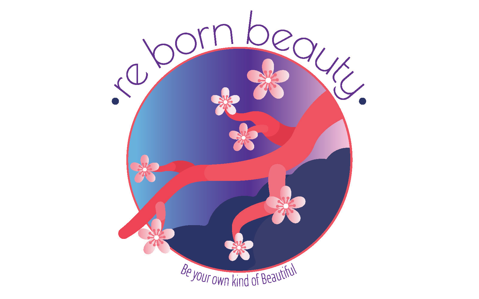
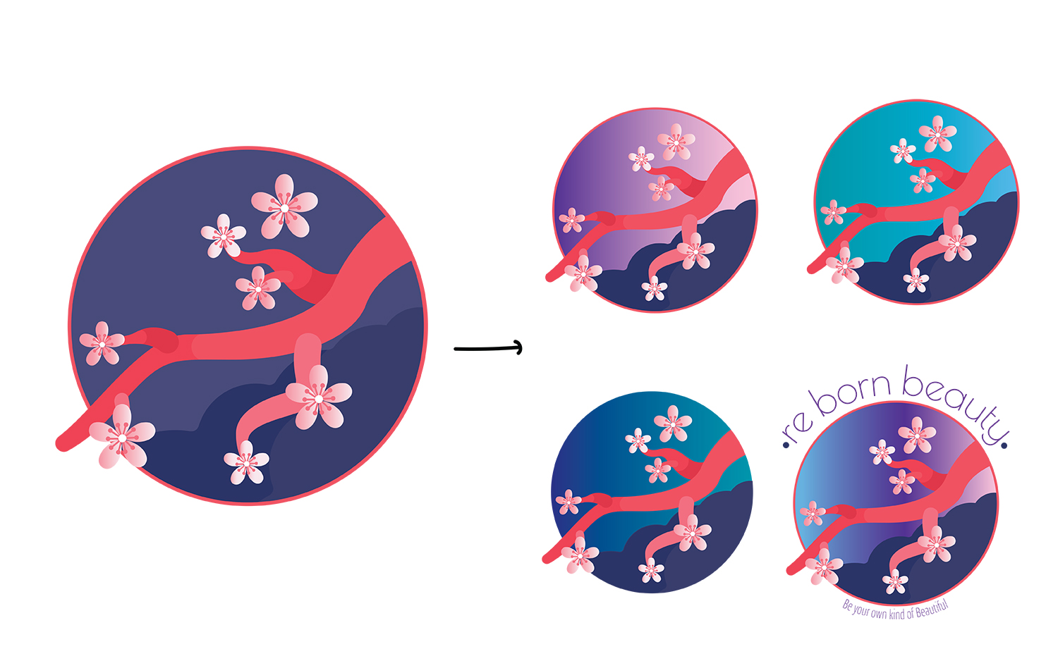
When building a brand every detail of the logo is important to the overall feel of the brand. Choosing the right colors and fonts are just as important as the art work.
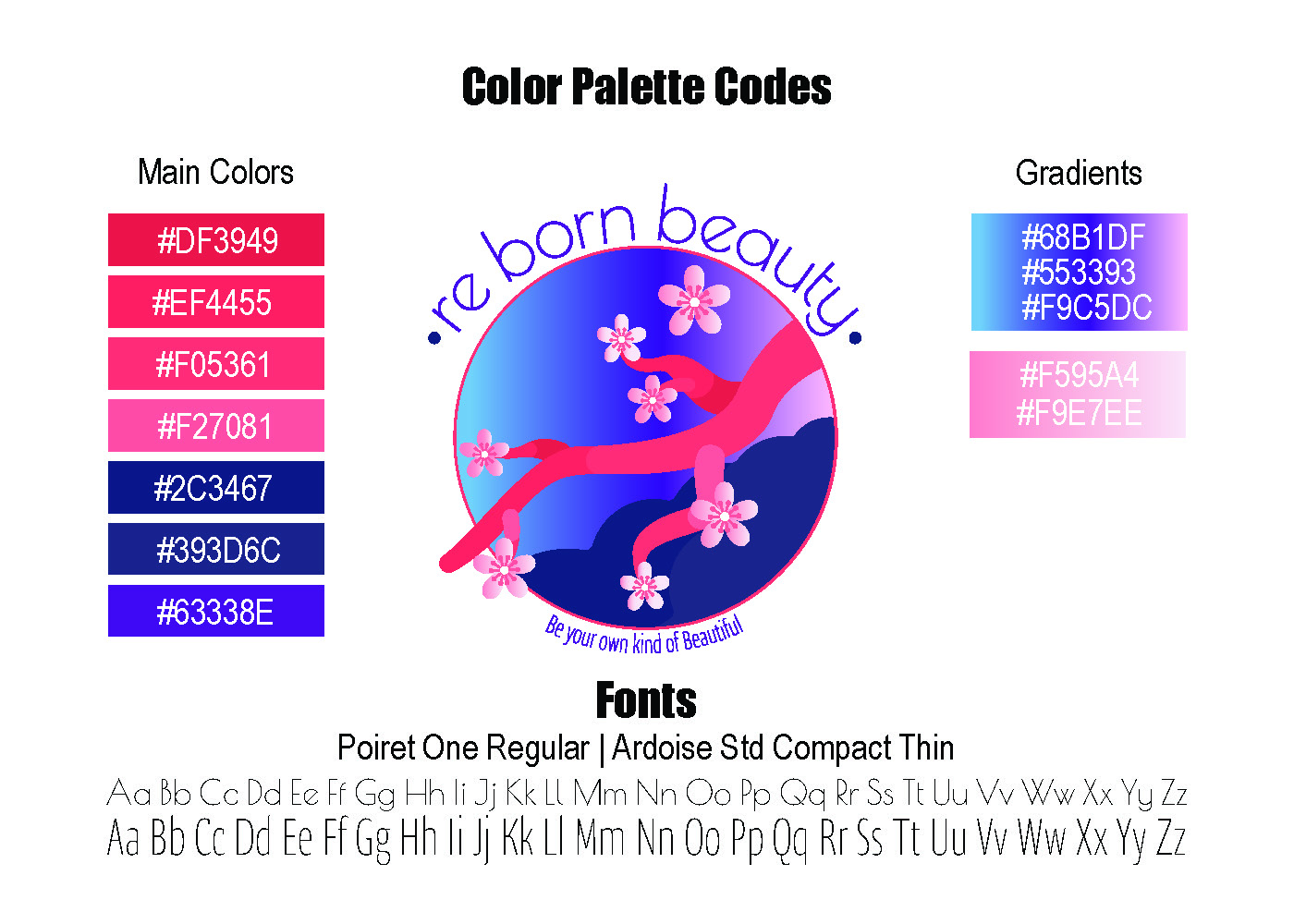
The client chose to go with these colors because she liked the color combinations but also because of their positive meaning. We believe that these colors are a great representation of her company.
- Pink Femininity, warmth & love
- Blue Loyalty, mastery & respectability
- Purple Authenticity, High Quality & Introspection
For the font we wanted to use something that would convey a kind and inviting feeling. After being shown a few different fonts, the client decided to go with Poiret One Regular in all lower case and Ardoise for the tag line. Using lowercase letters in logos is one way to portray kindness and makes the company feel more approachable.
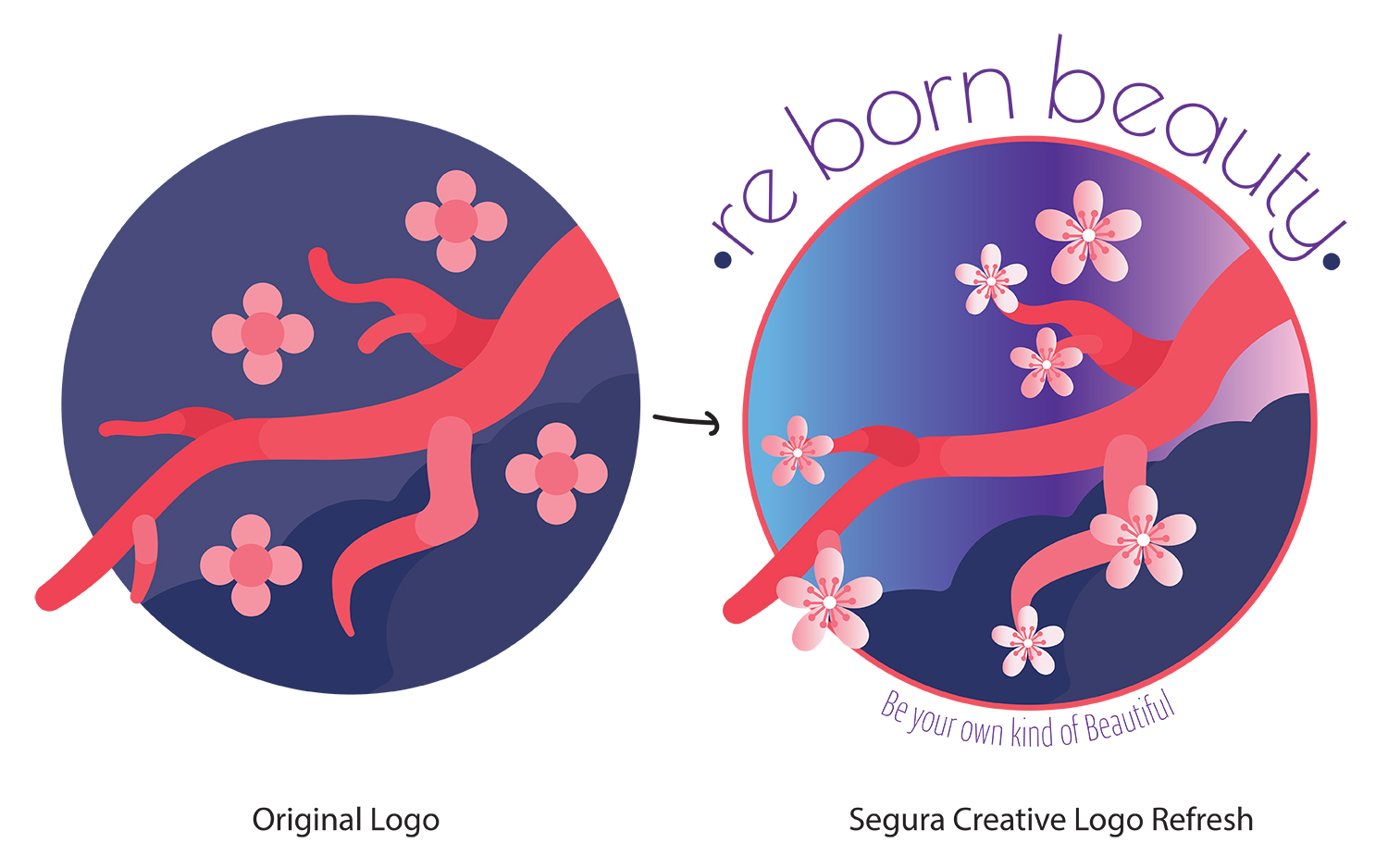
The symbol that the client chose to represent her business was the cherry blossom tree. The cherry blossom represents a time of renewal and optimism.
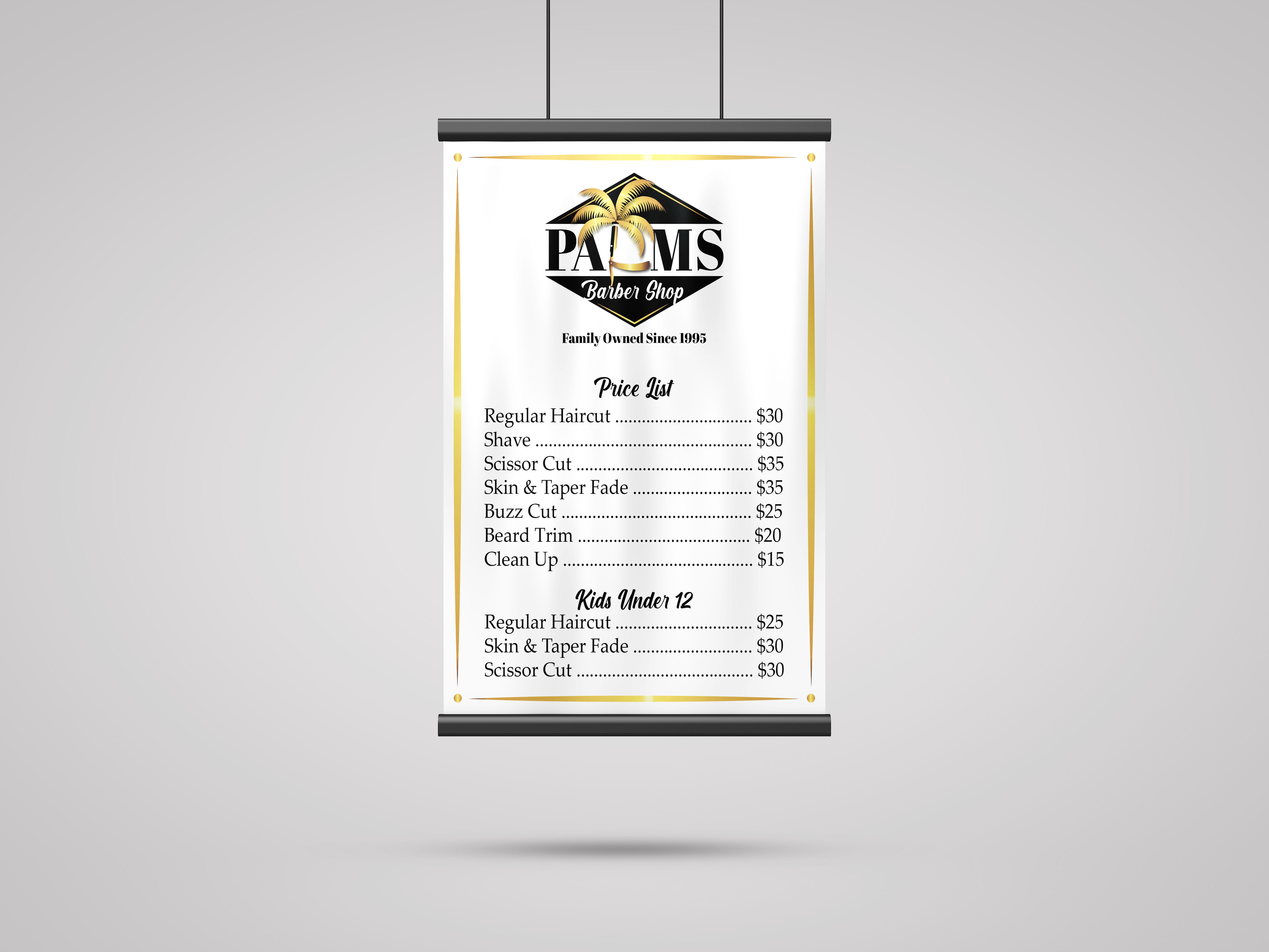
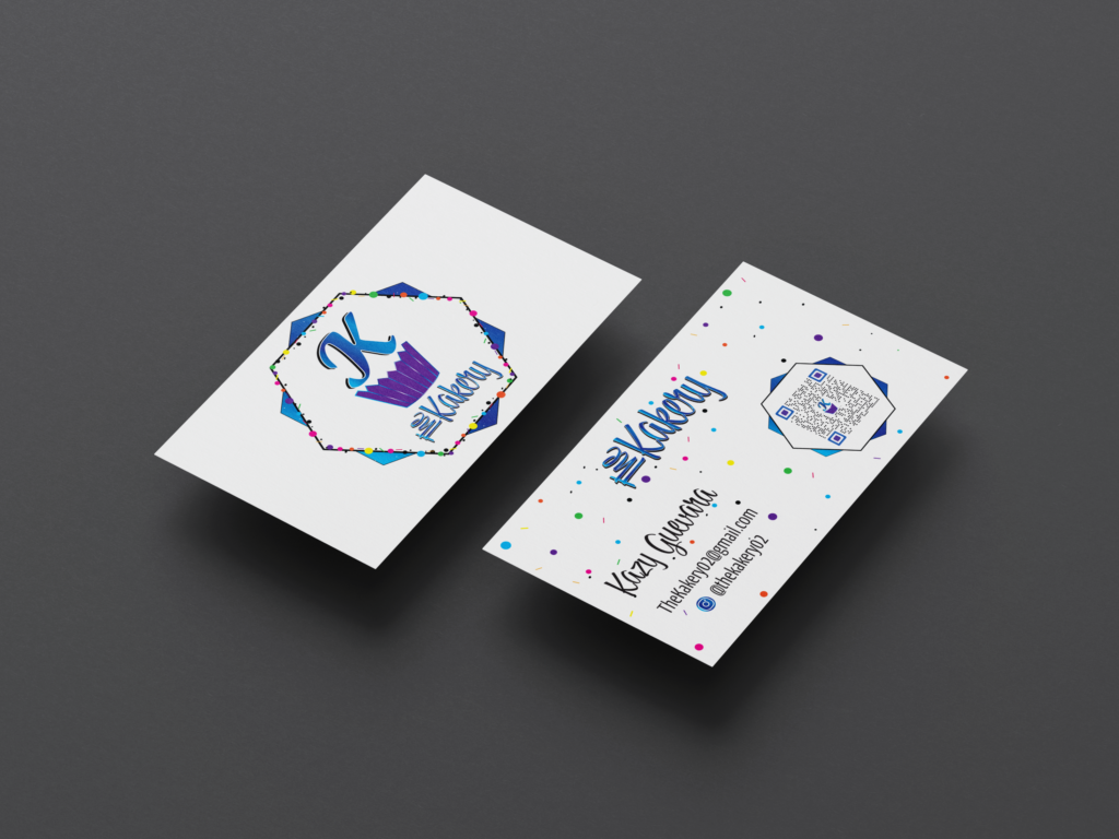
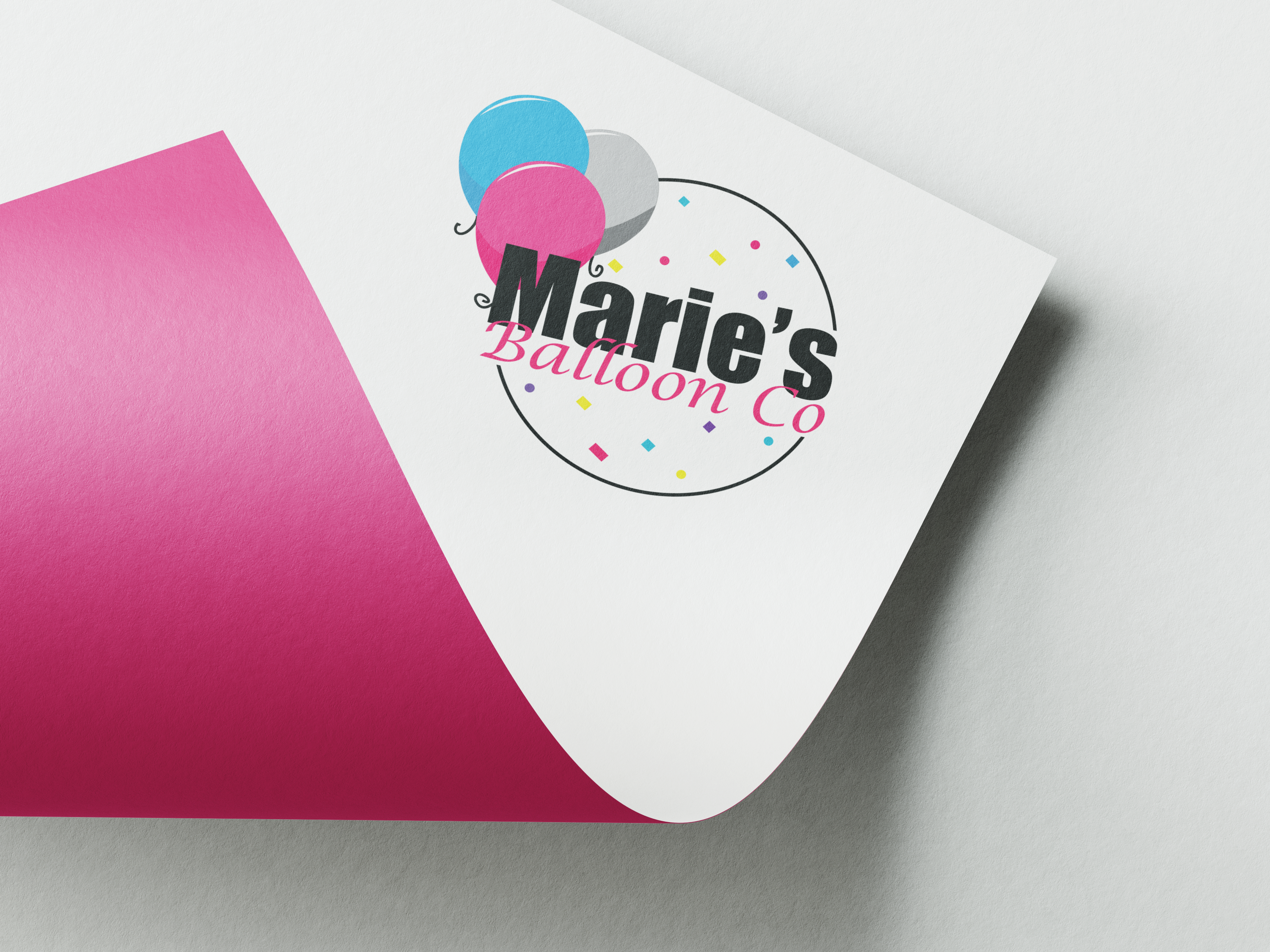
Final Products
More Projects ...
Ready To Get Started?
Are you ready to start on your next project? We are ready to help! Click the button below to schedule a consultation call.
