Lincoln Barbers
“I needed professional parking signs for my business and got lucky to find Segura Creative. Jay was quick to design and gave me a reasonable price. I definitely recommend and look forward to doing business again.”
-Rafael Recendez | Lincoln Barbers Owner
About The Project
The first step to helping our clients includes gathering important information. This information will help shape the rest of the project.
Sketching
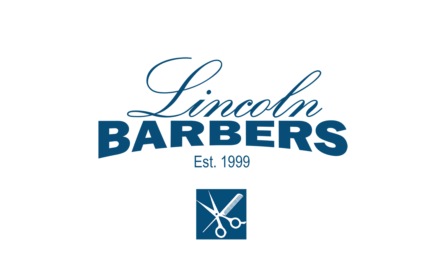
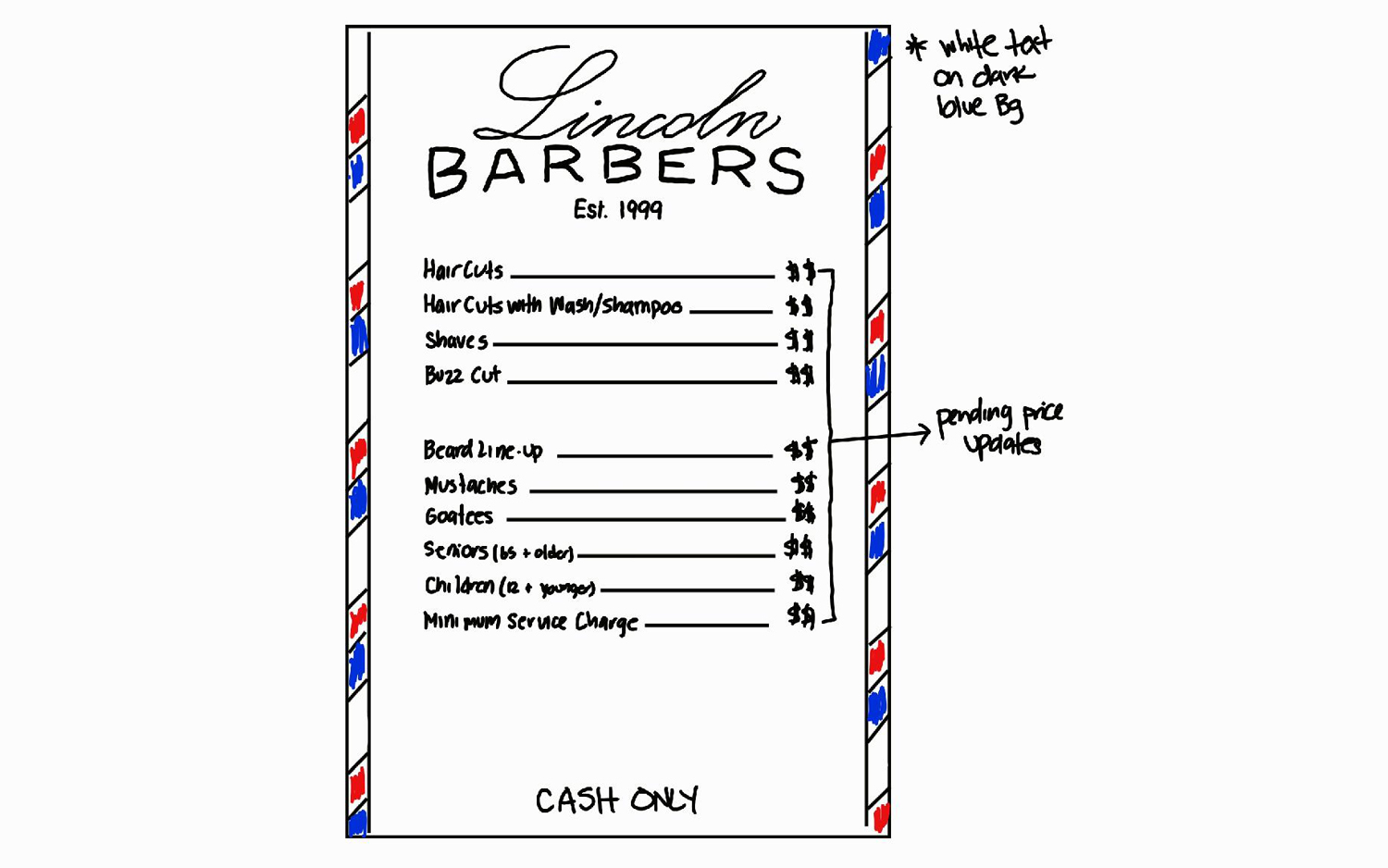
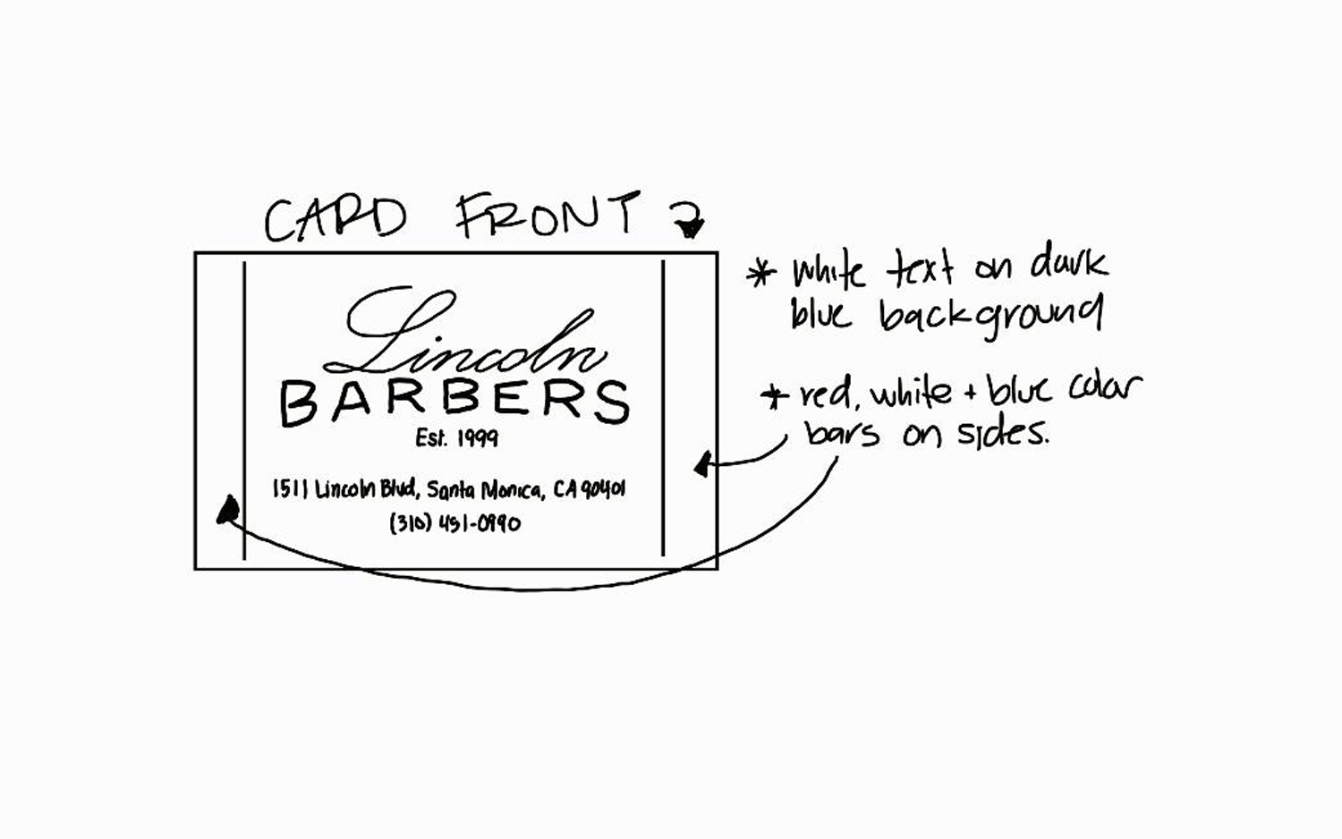
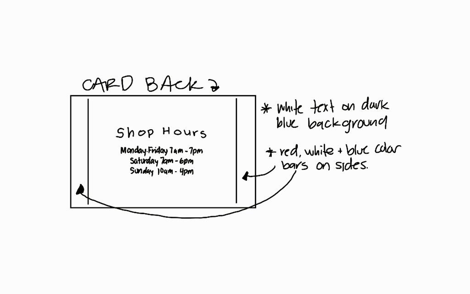
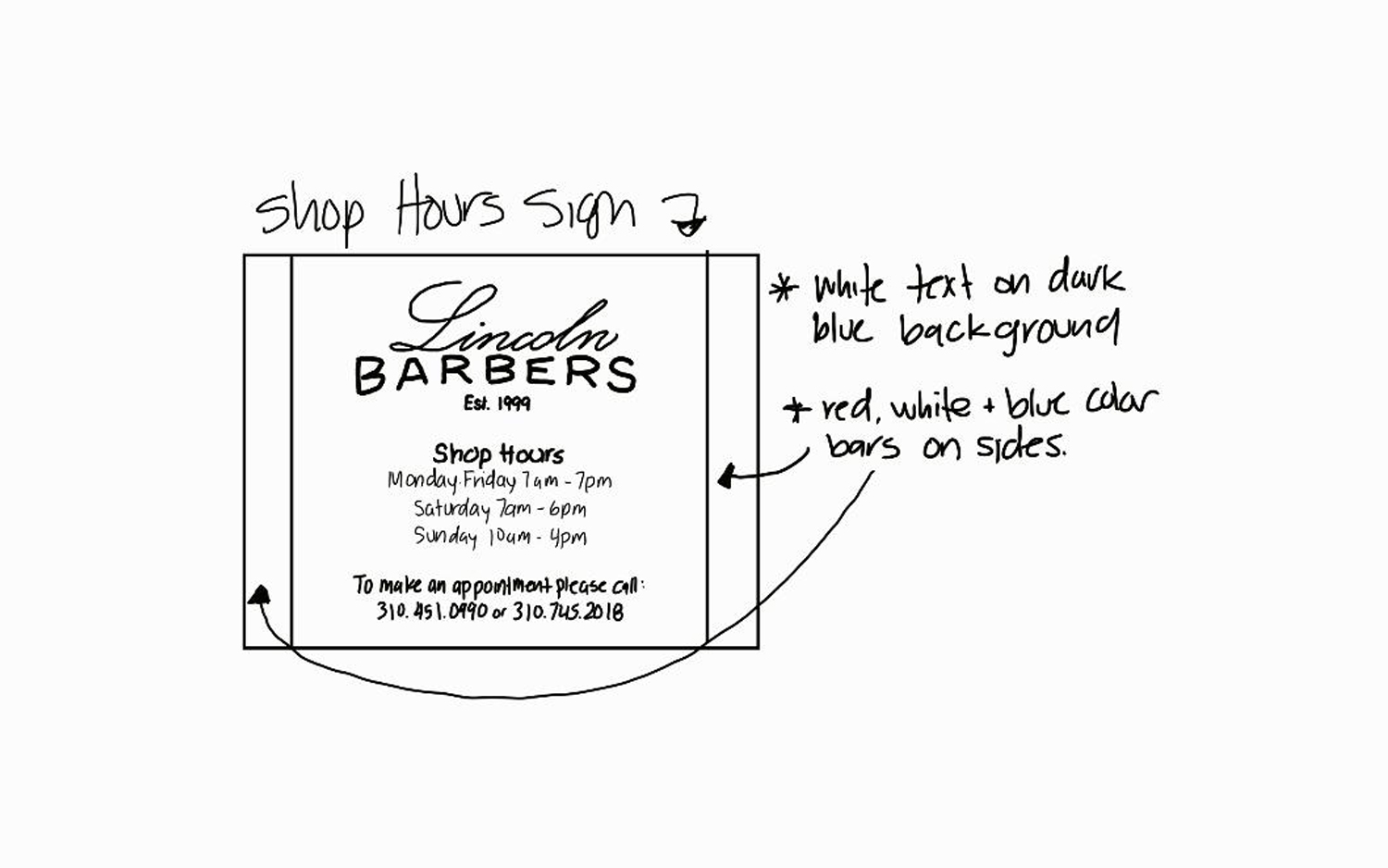
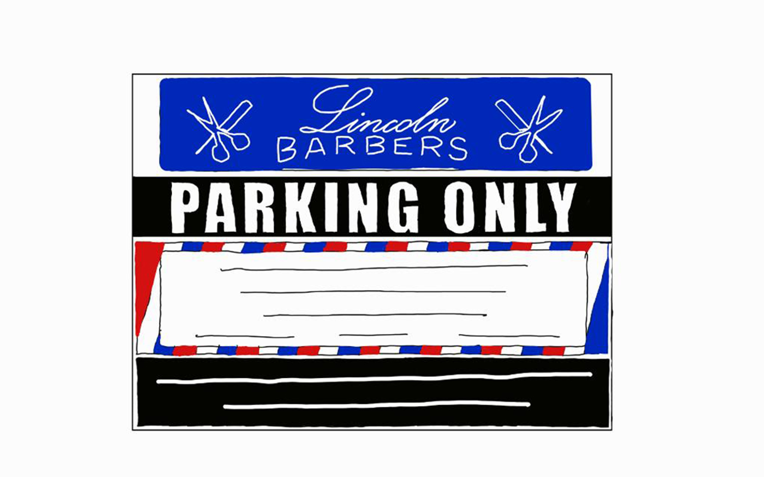
First thing to do was sketch everything and have the client confirm all the information. It was crucial to make sure that the hours, phone numbers and pricing were all correct.
Project Specification
When building a brand every detail of the logo is important to the overall feel of the brand. Choosing the right colors and fonts are just as important as the art work.
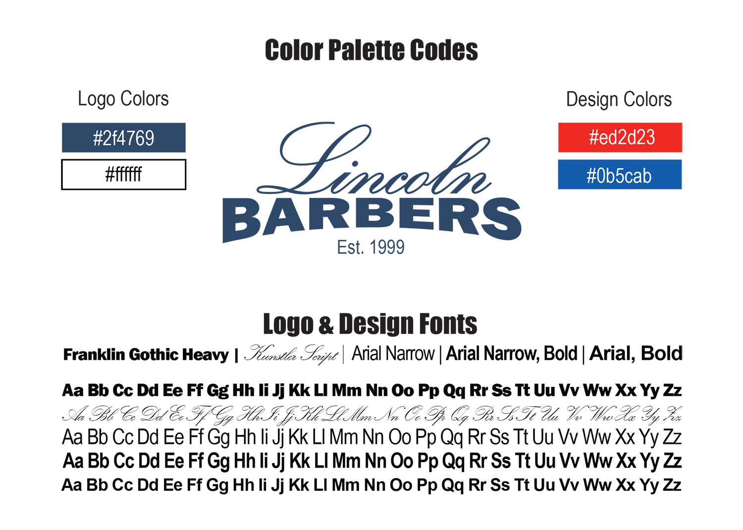
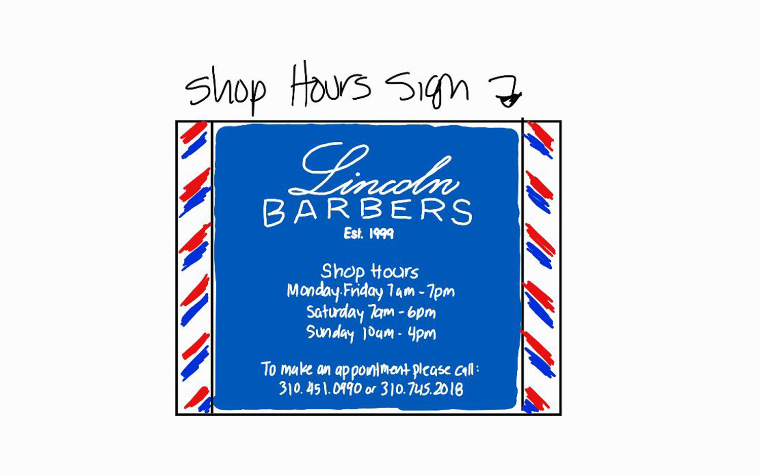
The design of the slanted bars composed of Red, Blue & White were intended to follow the feel of old-school barber shops. The colors we used are slightly brighter than the traditional colors to make it a little more modern.
The logo is composed of two fonts, Franklin Gothic Heavy & Kunstler Script. Aside from the logo, the body of designs are composed of 3 variations of the Arial font as well as Franklin Gothic Heavy. Changing the variation of the same font with the combination of the thin and thick give the design the classic look and add a modern flair.
Throughout all the designs we repeat the alternating color bars which symbolize the barber pole.
Final Product
More Projects ...
Ready To Get Started?
Are you ready to start on your next project? We are ready to help! Click the button below to schedule a consultation call.
