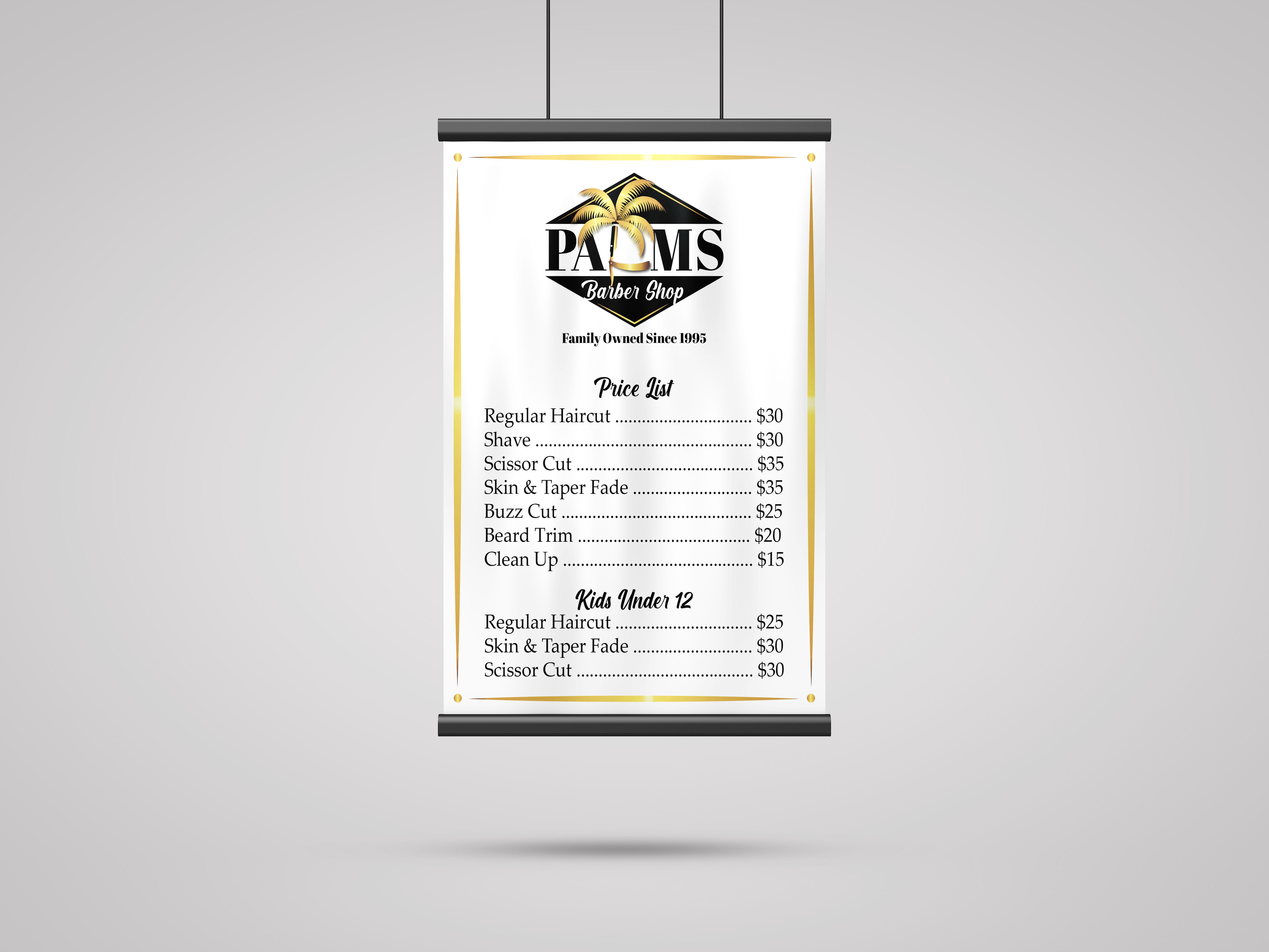
Palms Barbershop
Brand Identity Project
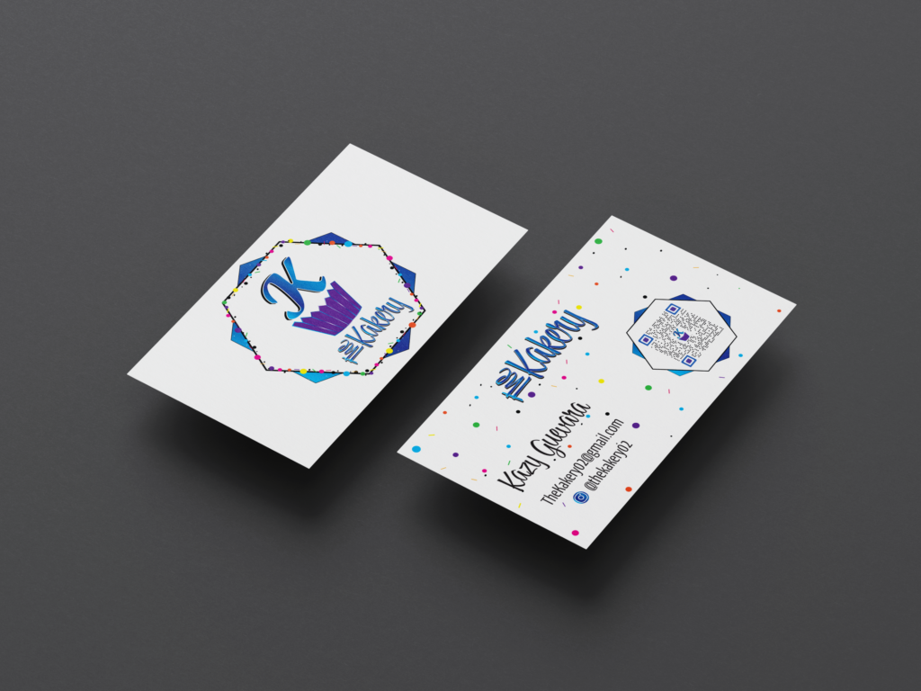
The Kakery
Brand Identity Project
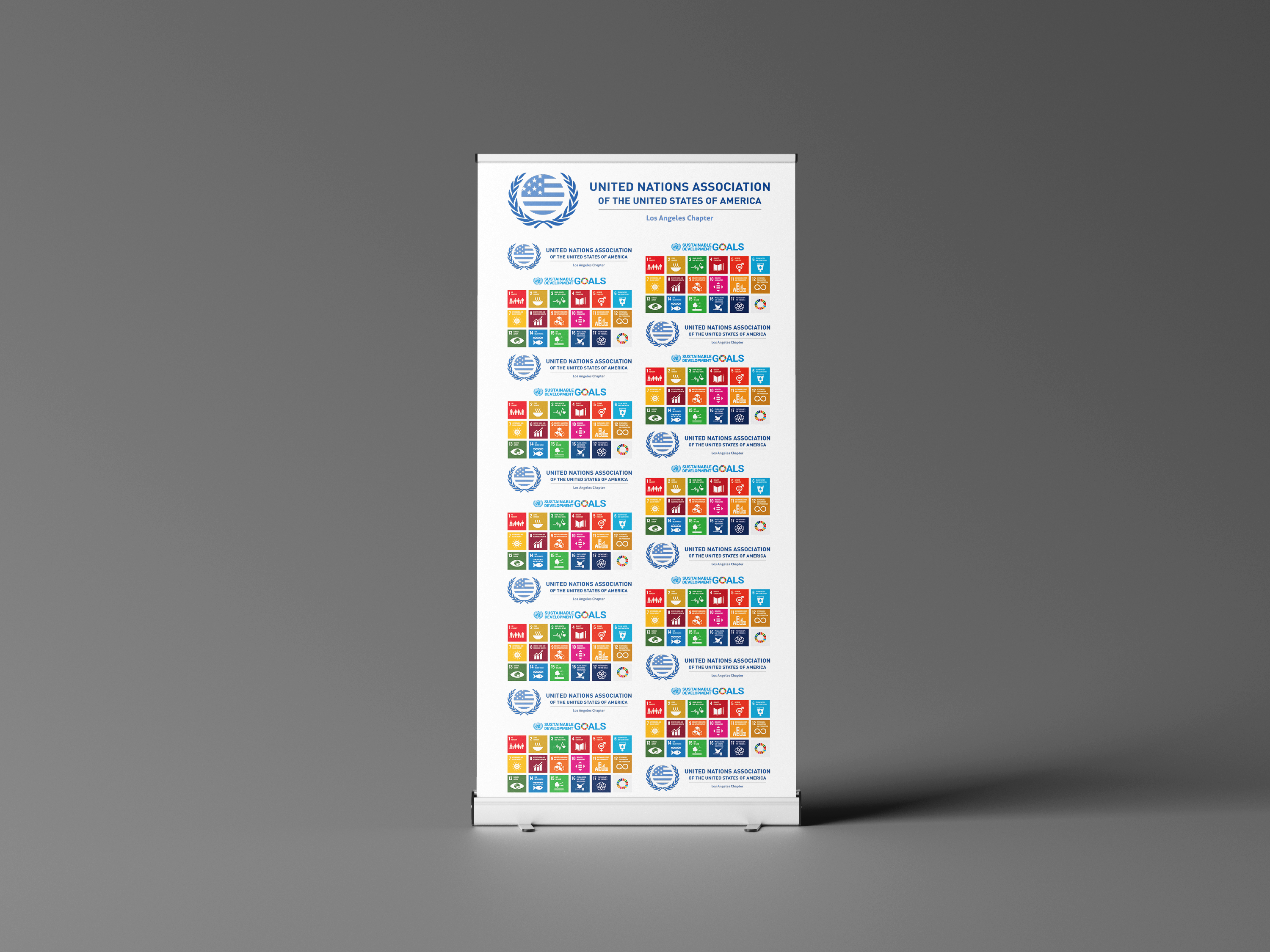
UNA LA Chapter
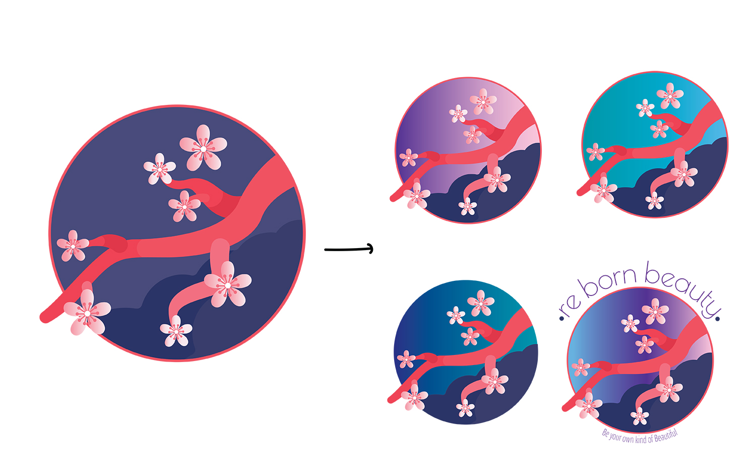
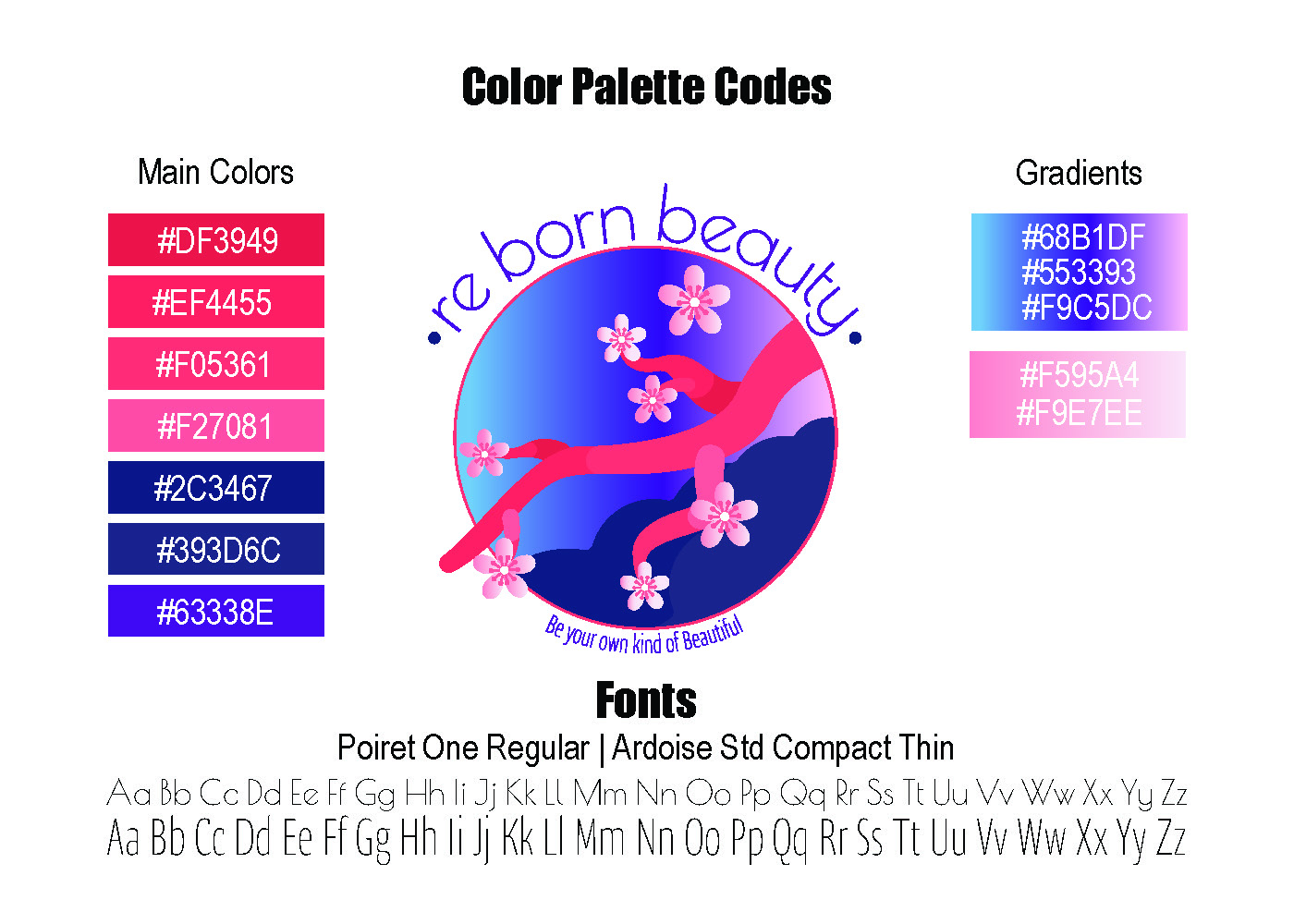
Brand Identity Project
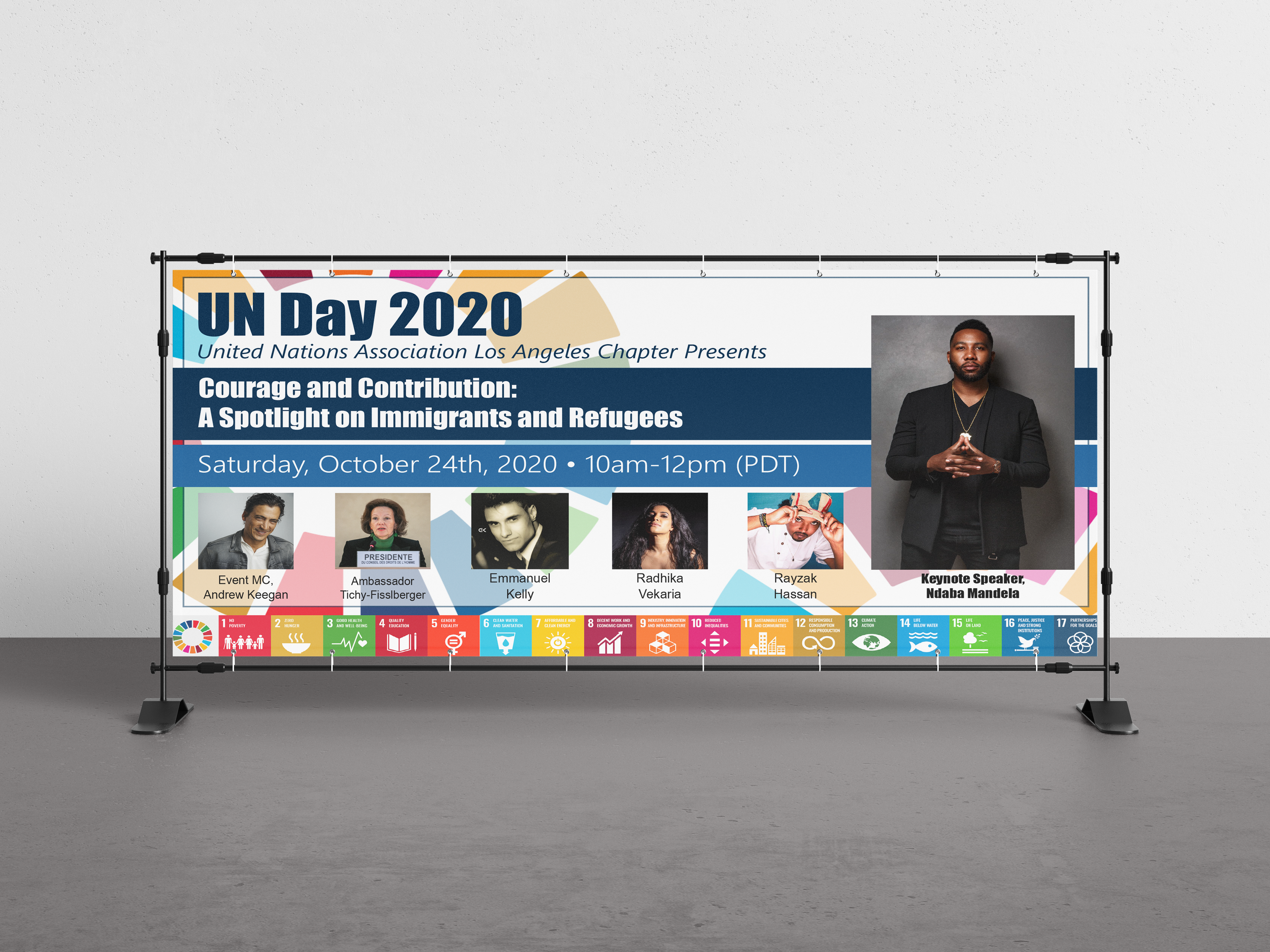
UN Day 2020
Event Marketing Project
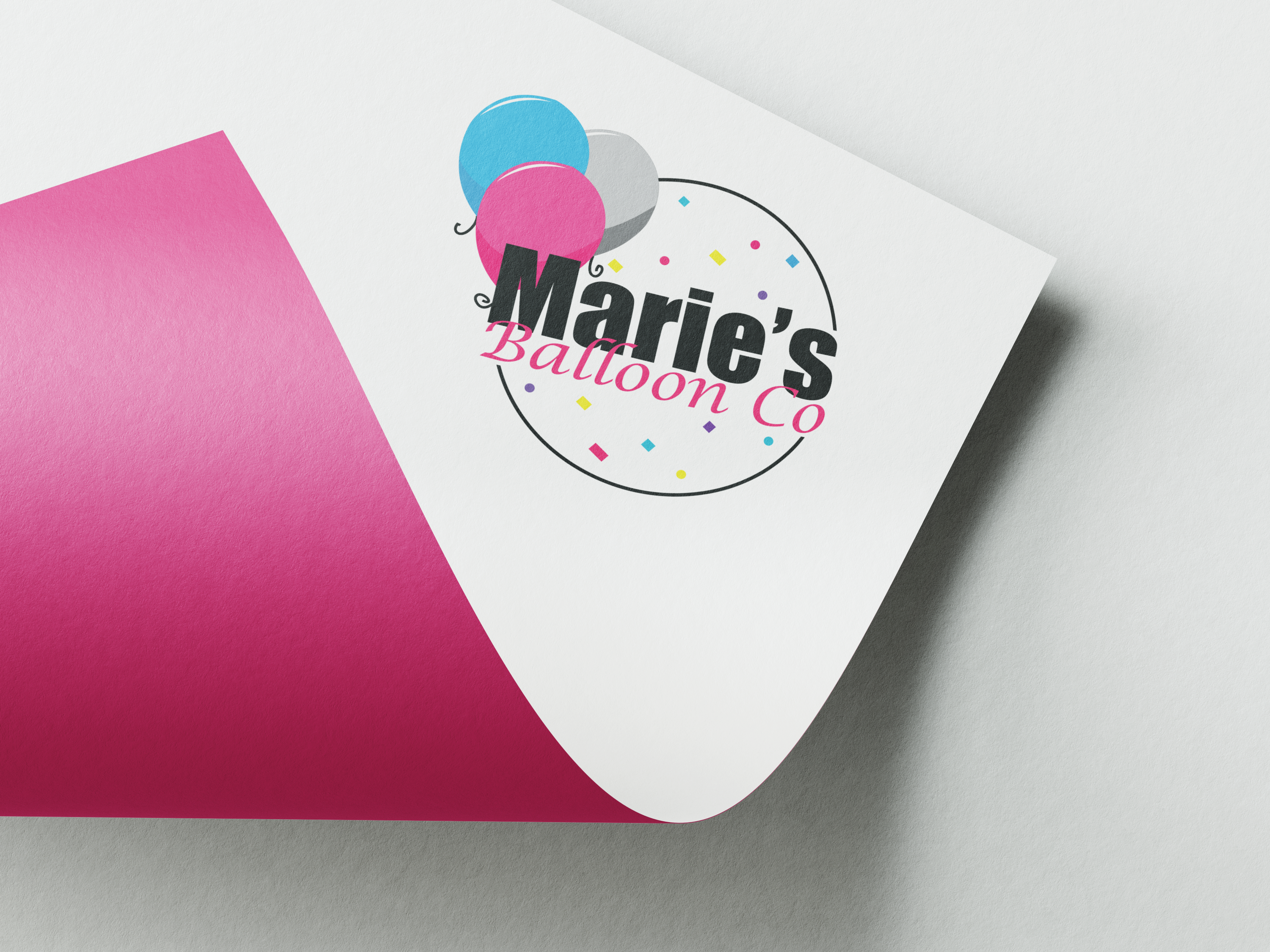
Marie's Balloon Co
Logo Design Project
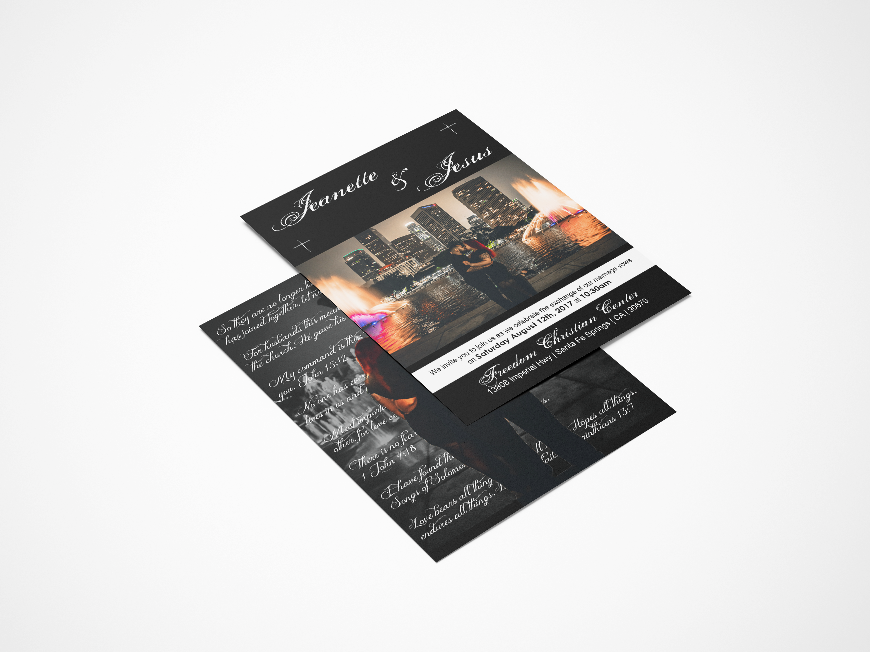
Segura Wedding
Wedding Invitations
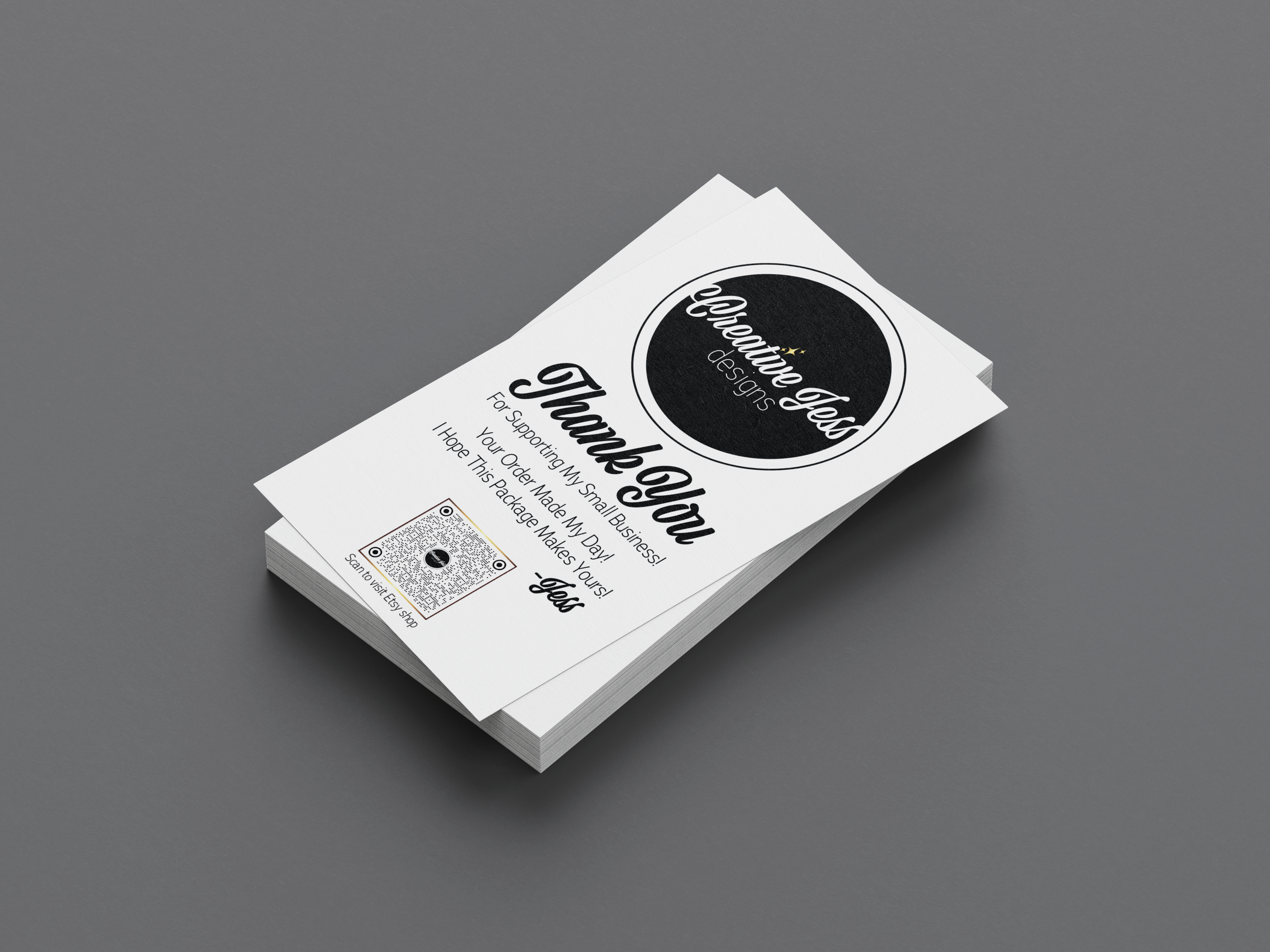
Creative Jess Designs
Brand Identity Project
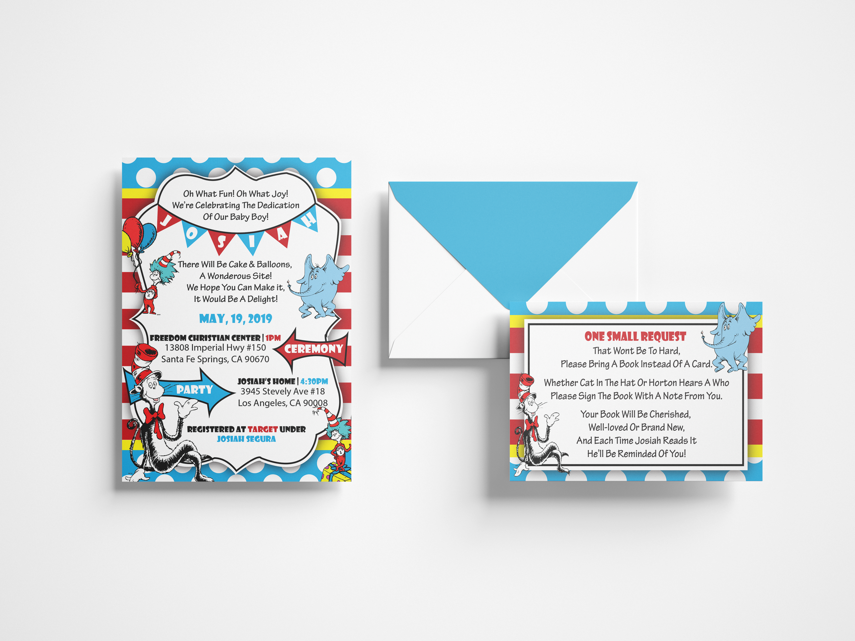
Baby Dedication
Event Package
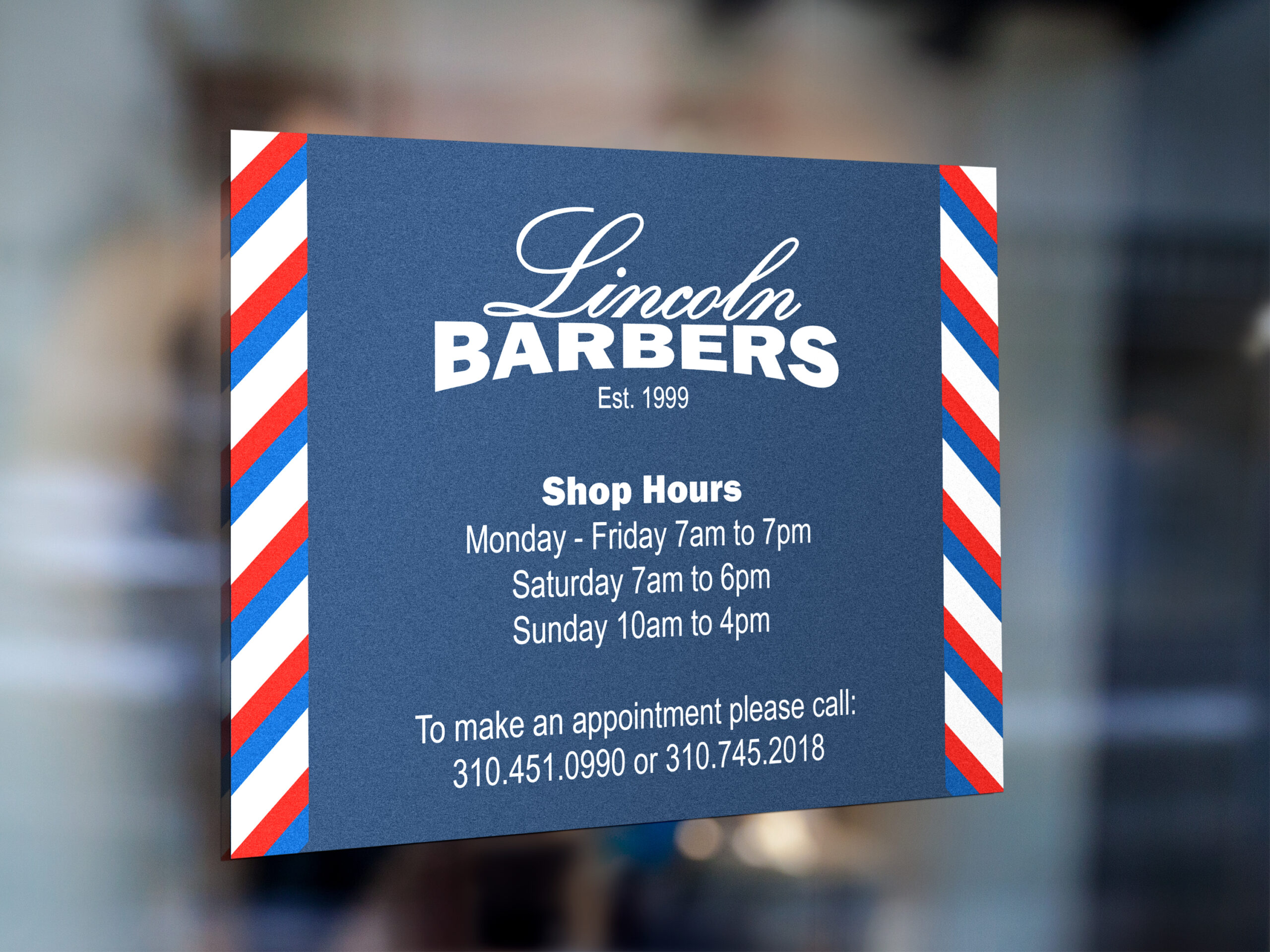
Lincoln Barbers
Brand Identity Project
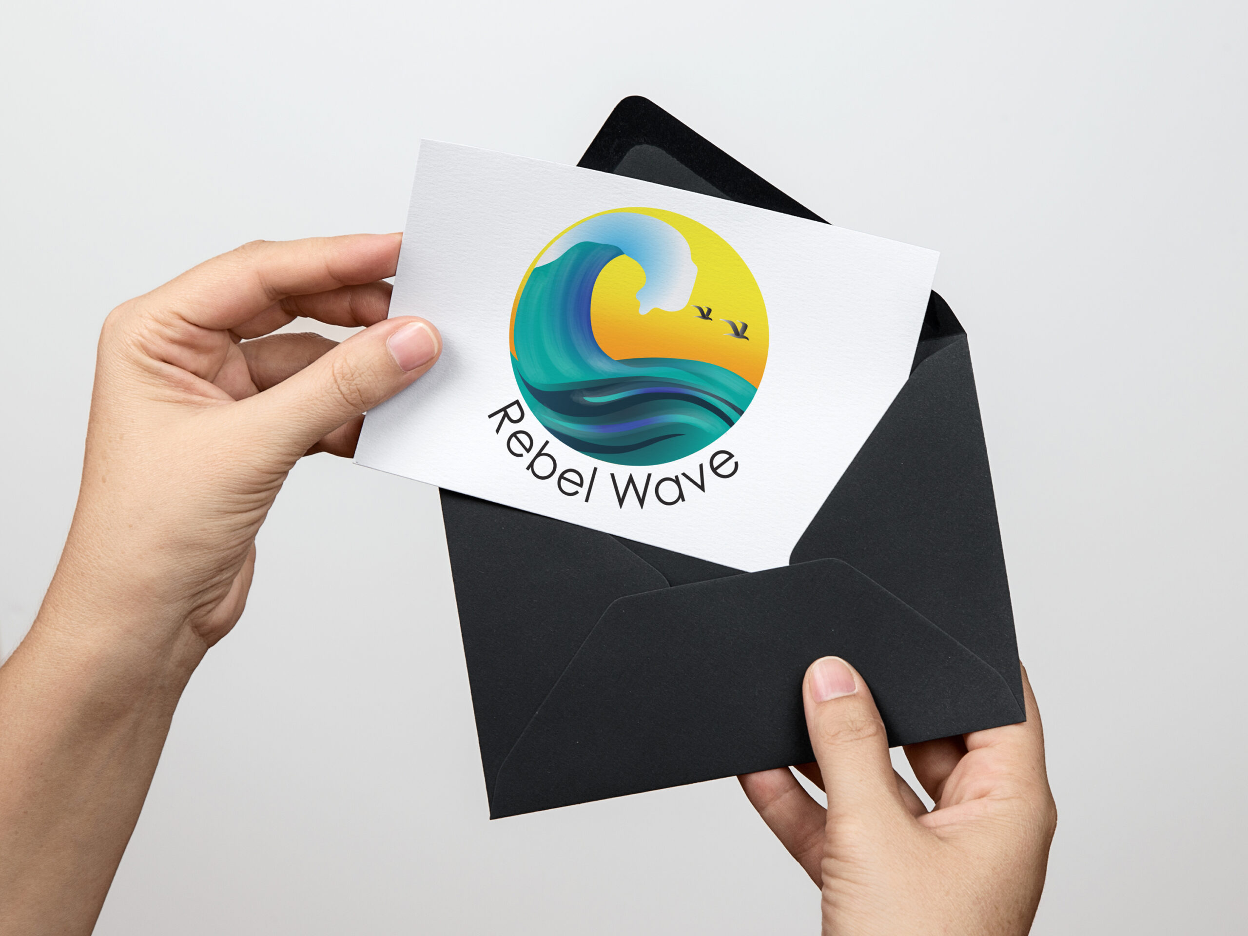
Rebel Wave
Brand Identity Project